BRIEF
In an increasingly competitive luxury skincare market, Susanne Kaufmann sought to elevate and enhance its brand presence and packaging to better reflect its Alpine heritage and pioneering approach to natural beauty.
With ambitions to enhance its positioning on the shelves of leading beauty and skincare retailers, it was my job to articulate its vision and create packaging that reinforces its distinctive status while staying true to its commitment to mindful, sustainable beauty.
SOLUTION
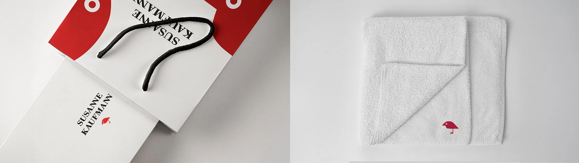
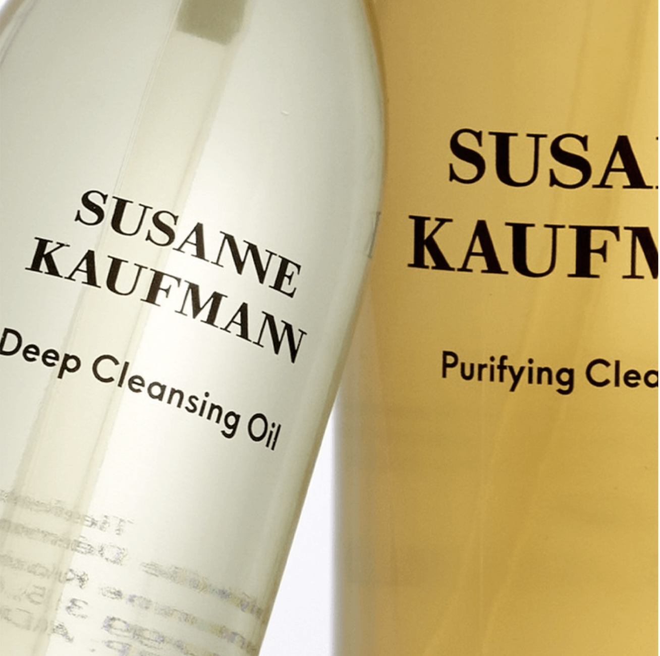
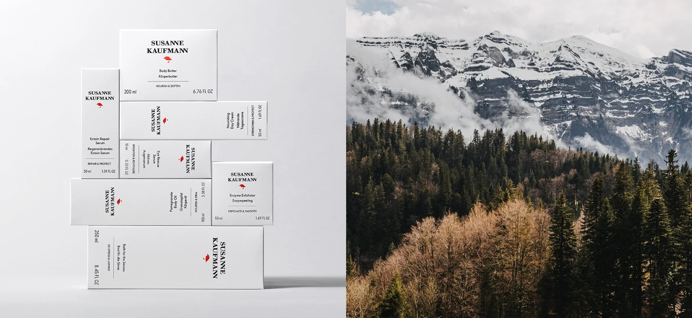
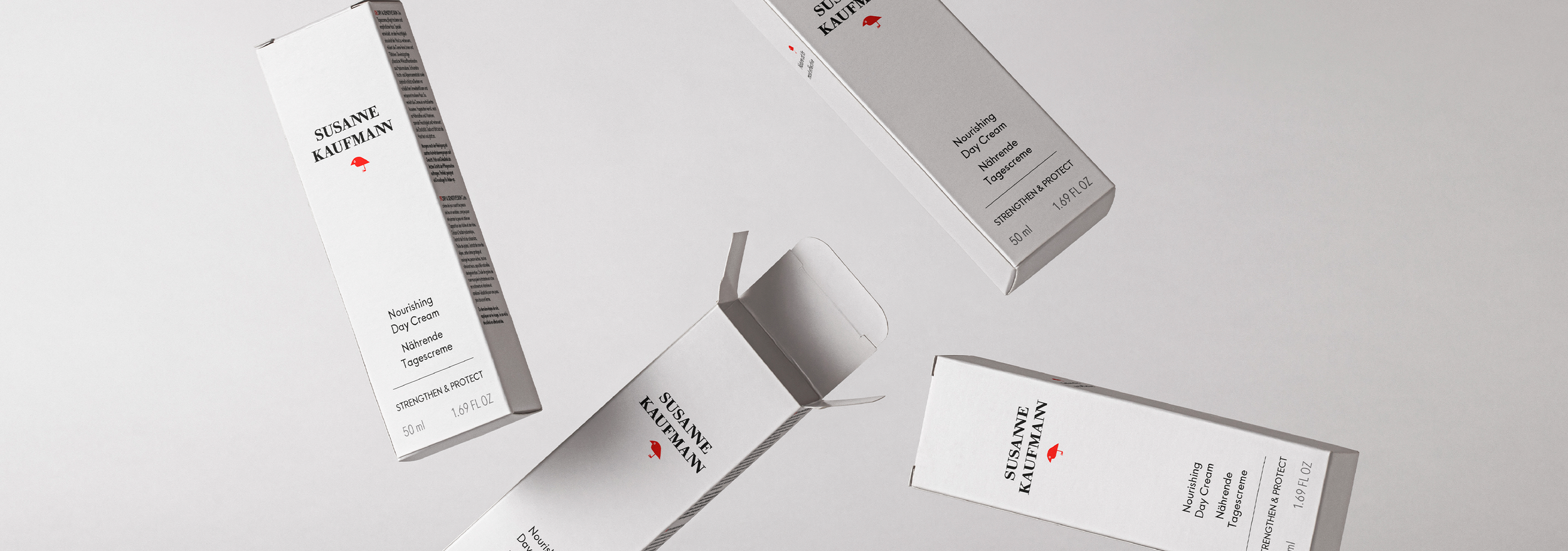
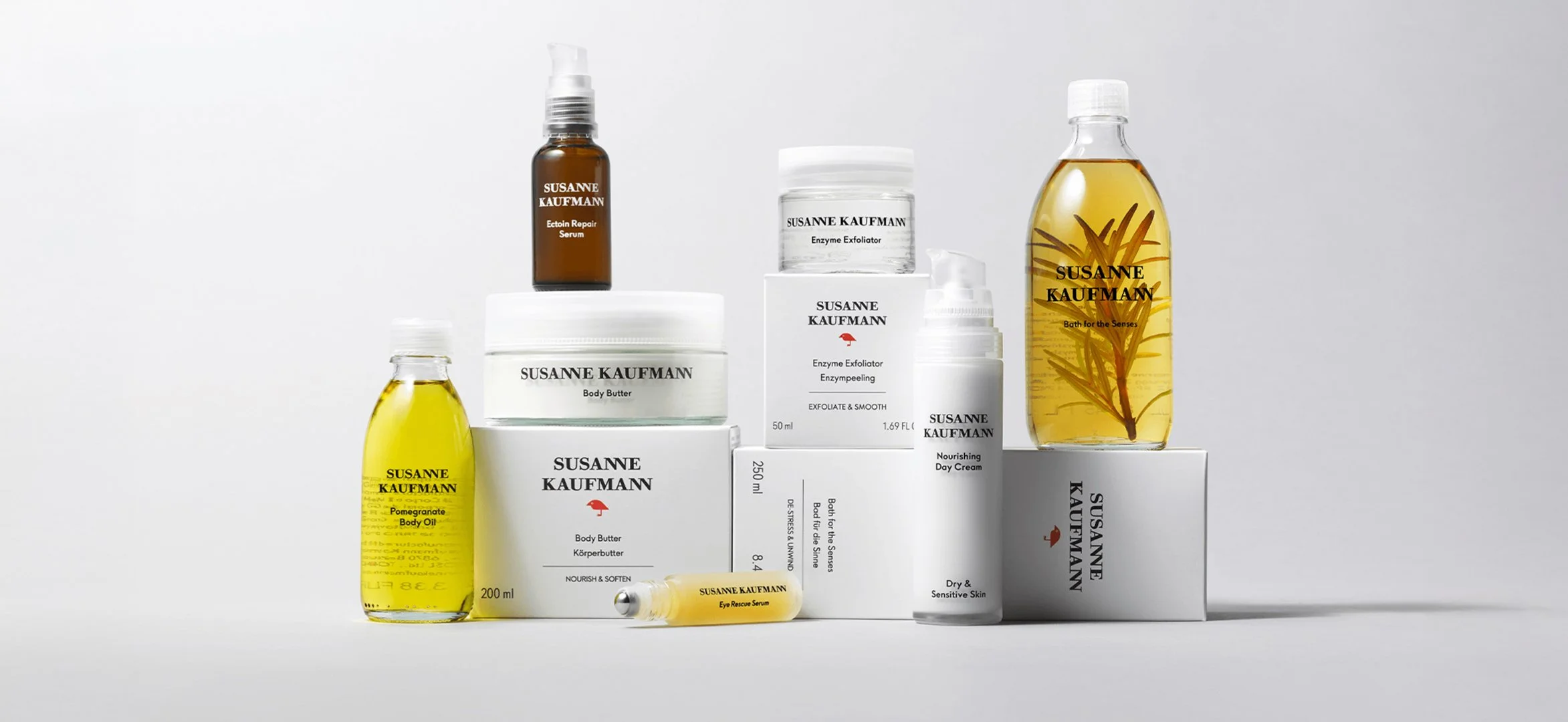
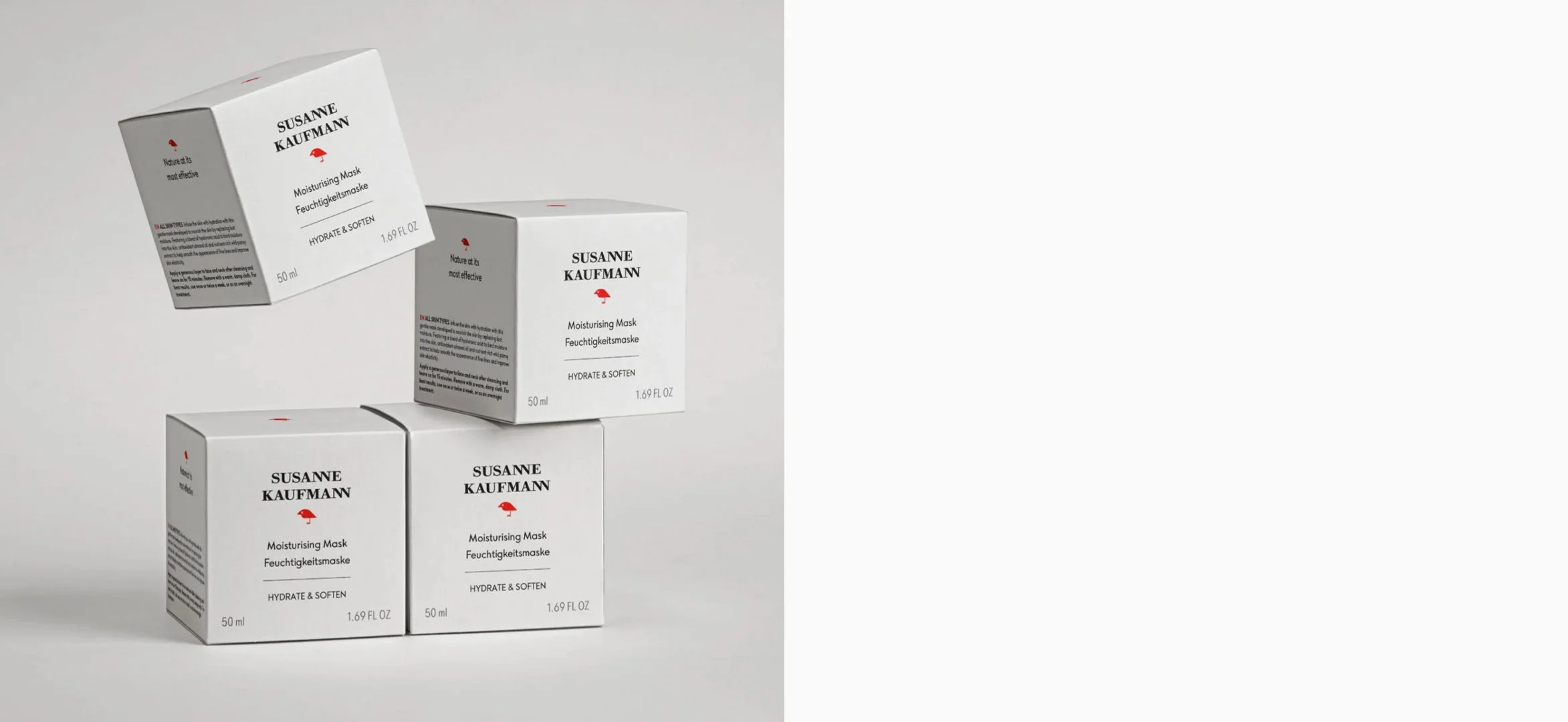
I led the redesign of Susanne Kaufmann’s secondary packaging, creating a system that balances understated luxury with a clearer, more ownable brand identity. At the heart of the concept is the bird, evolved from a seasonal detail into a permanent icon. With the brand lacking a distinctive visual asset, I elevated this motif into a recognisable symbol, anchoring the range and reinforcing its connection to nature, efficacy and sustainable wellbeing.
The design pairs this new iconography with a refined material approach, including soft-touch finishes and a stripped-back aesthetic that reflects the brand’s holistic philosophy. Alongside the visual work, I helped shape a more cohesive brand narrative, ensuring its Alpine roots, spa heritage and clean skincare credentials are communicated with clarity and consistency.
The result is a packaging system that feels timeless but flexible, giving the brand a stronger visual foundation to grow from.