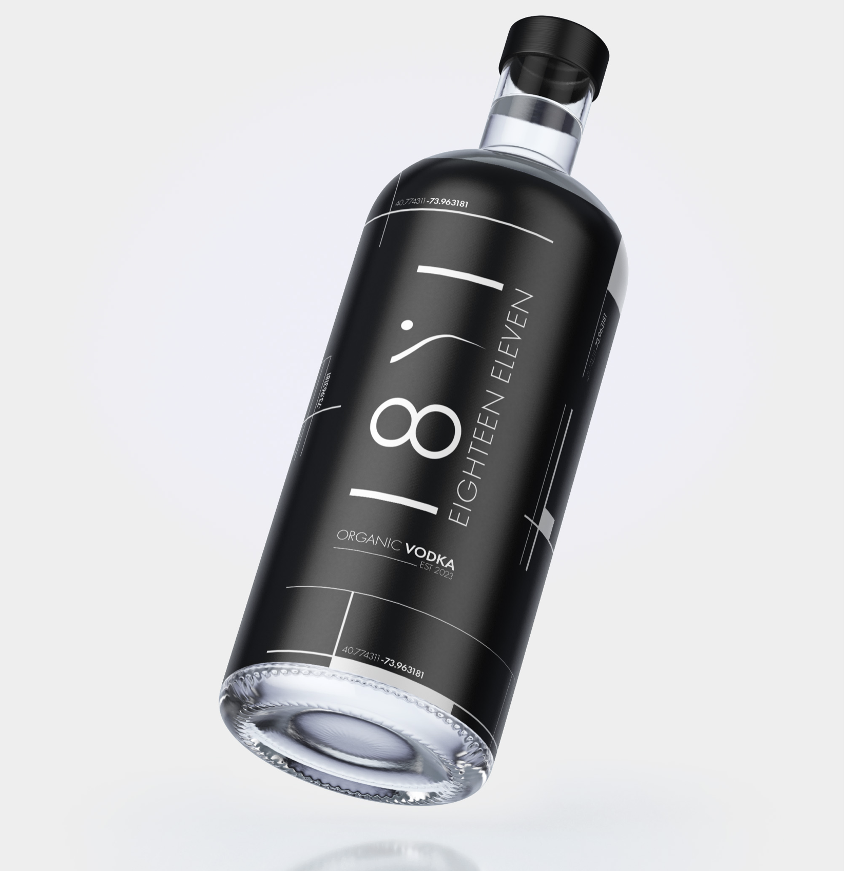
A vodka brand inspired by the unique grid map of Manhattan - guiding you to the bars where it’s being served.
Aimed at aspirational millennials who are future-thinking.
A drink that makes them feel chic and inspires success when poured in a martini or on the rocks.
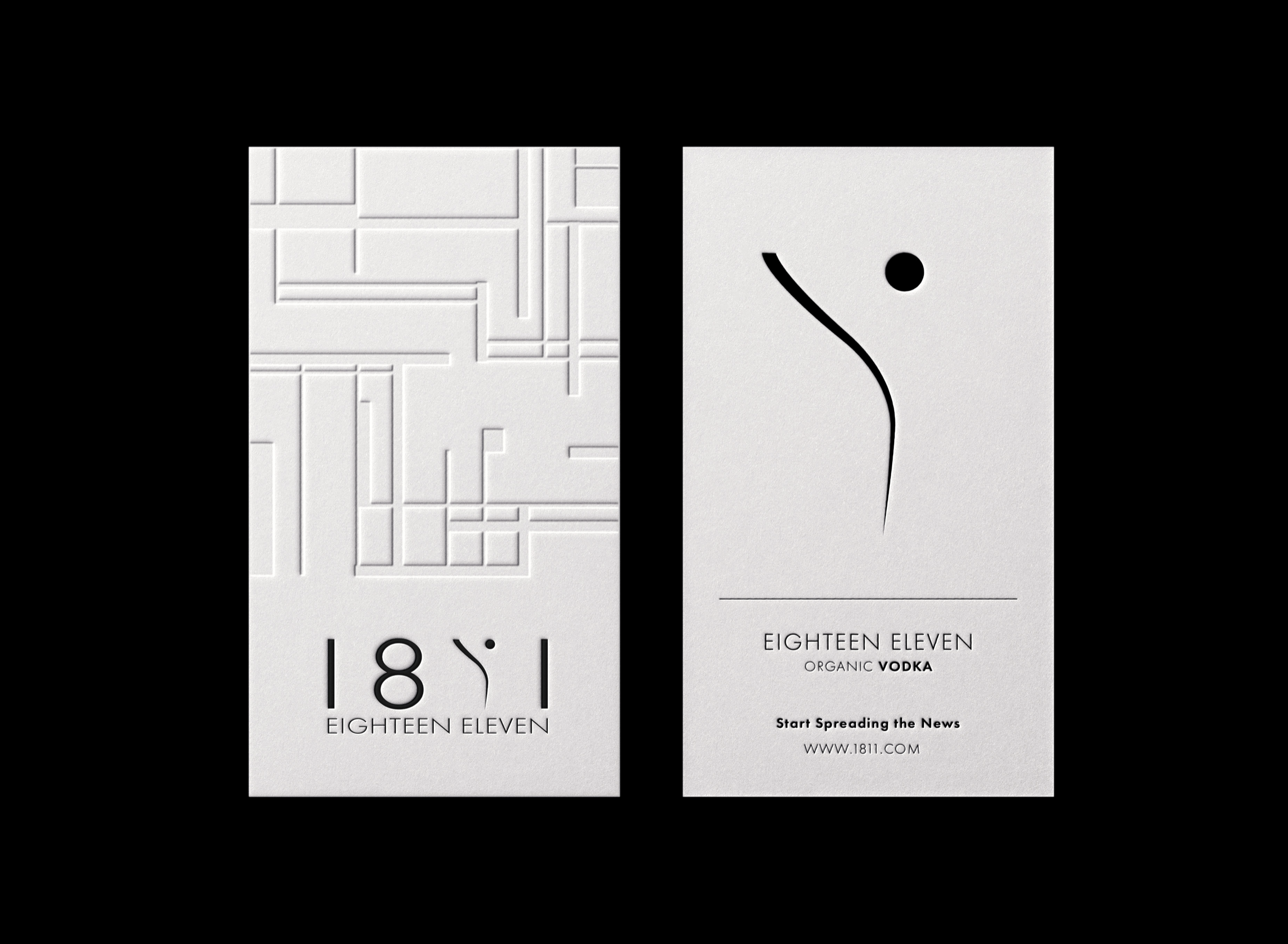
1811


The map was first designed in 1811. The word-mark fits into the map as a rectangle inspired by Central Park.
The monogram was drawn to reflect a curvature on the island that outlines the shape of a martini glass and olive.
Having the curved monogram allows the identity to stand out against the gridded toolkit, which makes the brand more recognisable.
Logo
PROMOTION
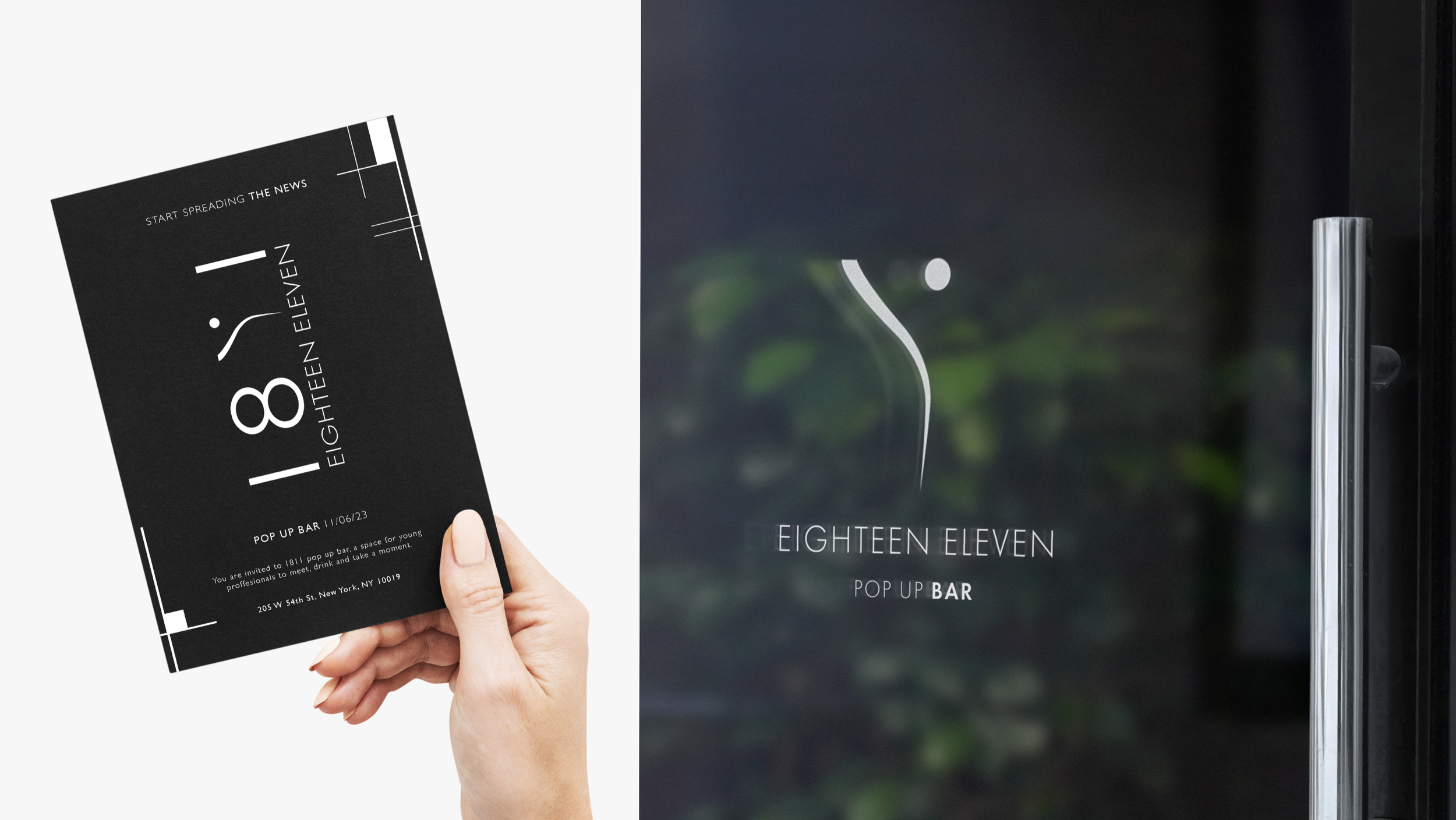
The target market of the brand is young, city-eyed professionals; wanting to romanticize city working and living.
A pop-up bar, for example, would provide brand exposure but be advertised as a way of meeting other young, like-minded professionals.